[CASE STUDY / 03]> PRODUCT REDESIGN

TAP Mindset
Product redesign /

I led the redesign of a mental-training product that had grown one feature at a time. The work was not to make it cleaner. It was to decide what the product was, for whom, and how the team could keep building it. 

The decisionOrganise the experience around each role's intent, not the feature list the product had accumulated.

Before proposing a new product, I had to understand the one we had inherited.

At first, it looked like a navigation problem.

People were getting lost, labels overlapped and equivalent actions behaved differently. The obvious response was to simplify the interface.

That reading was useful, but incomplete. When I mapped the recurring journeys, the same problem appeared underneath every screen: a single product was trying to serve three different jobs without making the boundaries visible.
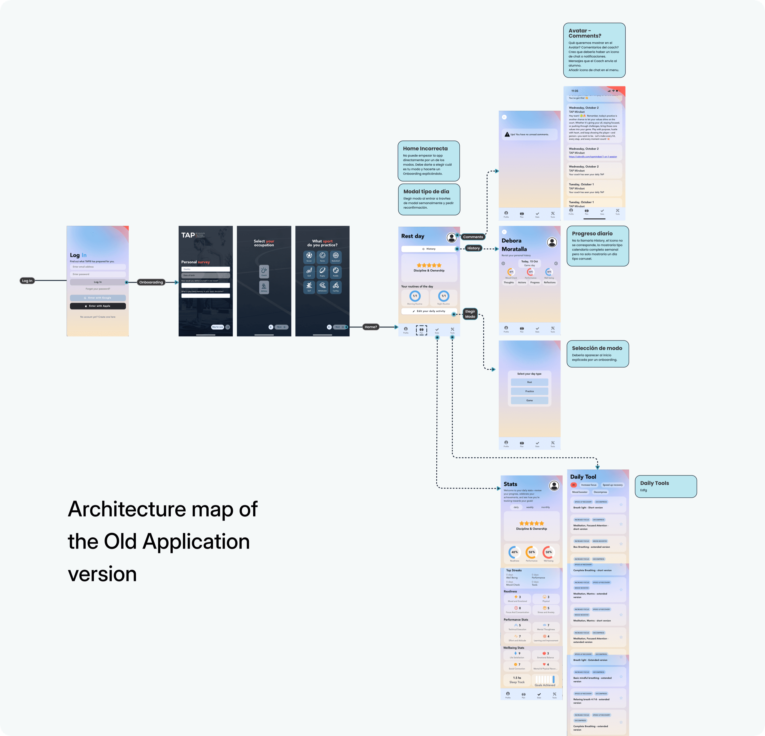
Home was carrying too much.

It was a starting point, a mode selector, a progress view, a communication surface and a shortcut to daily tools. Each new feature added another decision before an athlete could begin.

  • Shared capabilities had different names.
  • Role-specific actions lived inside common flows.
  • New work created exceptions instead of extending a pattern.
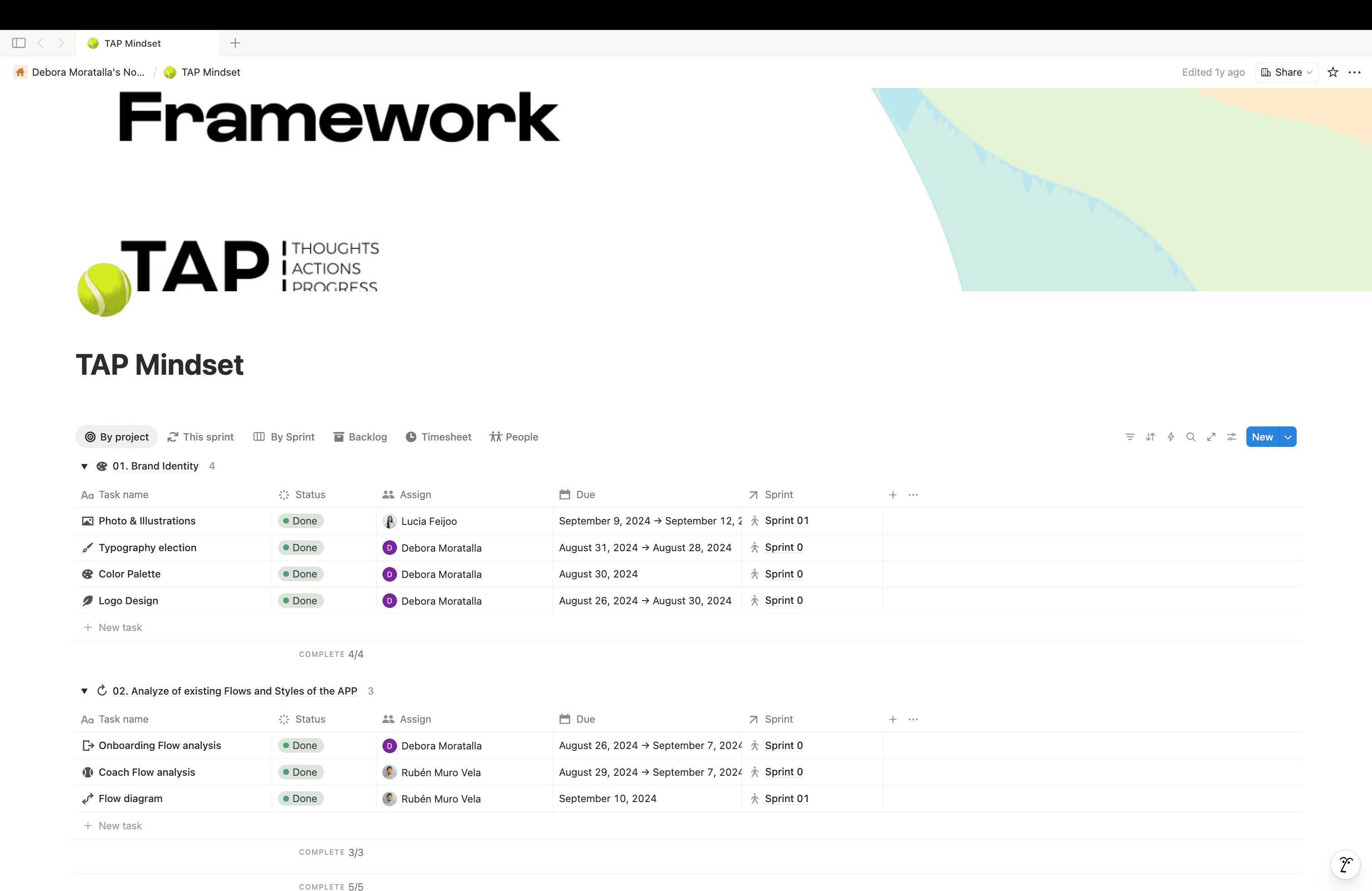
Audit map of the inherited TAP Mindset application

This was not a navigation problem.

Navigation was where the fragmentation became visible. Underneath it, one product was serving three jobs without a shared model. Every new feature added decisions for users and exceptions for Design and Engineering.

UI symptom → product architecture
VISIBLE SYMPTOM

People were getting lost in navigation.

→
PRODUCT PROBLEM

Three roles were sharing one structure without sharing one job.

The redesign needed rules the whole team could use when I was not in the room.

At that point, I decided the team needed something more useful than a new set of screens. I turned the diagnosis into four working principles we could use in critiques to decide what stayed, what moved and what we deliberately did not build.

  1. 01Clarity over density

    Make the next useful action obvious.

  2. 02Momentum before detail

    Earn personalisation after the first value.

  3. 03Structure by intent

    Organise around what each role is trying to do.

  4. 04Consistency at scale

    Reuse product decisions, not only components.

Then I changed the organising idea. The shared system stayed underneath, but the experience above it changed according to the job each person came to do.

ONE PRODUCT
01

Mental coach

Defines the method and follows progress over time.

02

Coach

Turns the method into plans, groups and daily guidance.

03

Athlete

Prepares, practises, reflects and comes back.

Let athletes do something useful before asking us to know them.

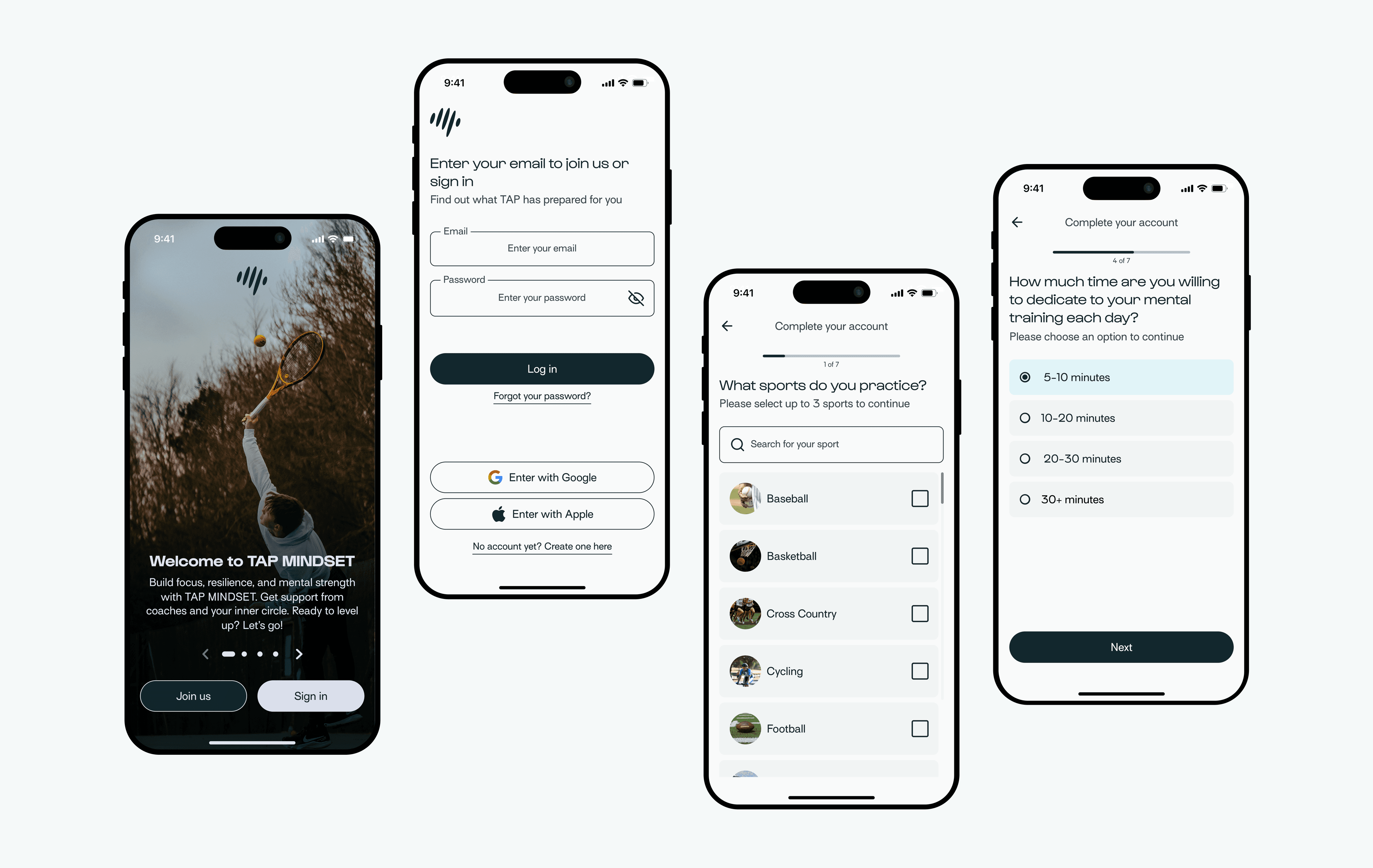
I started with activation because it exposed the product logic quickly. The old onboarding front-loaded personalisation, so we shortened the entry and moved profile questions into a staged sequence after the first meaningful session.

TRADE-OFF

Less tailored on day one.

↔

More chance of reaching value while motivation was still high.

The redesigned TAP Mindset onboarding sequence
ONBOARDING / A STAGED ENTRY INTO THE PRODUCT

The useful version did not arrive in one pass. We made it, found where it broke and changed course.

I split the redesign into decisions the team could ship.

Then I got the work out of the presentation and into delivery. Foundations came first, then the inherited flows, then role architecture and activation. I ran critiques with two product designers, brought engineering constraints in early and kept final decisions tied to the four principles.

The plan moved. A coach flow exposed assumptions in the athlete experience; an implementation constraint changed how progressive disclosure worked. We updated the sequence instead of protecting the original deck.

TAP Mindset delivery plan organised by sprint
EARLY VERSION

We simplified too far.

The primary route was clearer, but exploratory users lost context and experienced the product as restrictive.

WHAT CHANGED

We put depth back — later.

The next action stayed obvious. Secondary information and tools returned through progressive disclosure, available when the moment called for them.

The interface had to preserve the product logic.

We separated daily action from long-term progress, made state and hierarchy explicit, and moved repeated decisions into shared foundations. This was where the product redesign and design-system work met.

Read the design system case
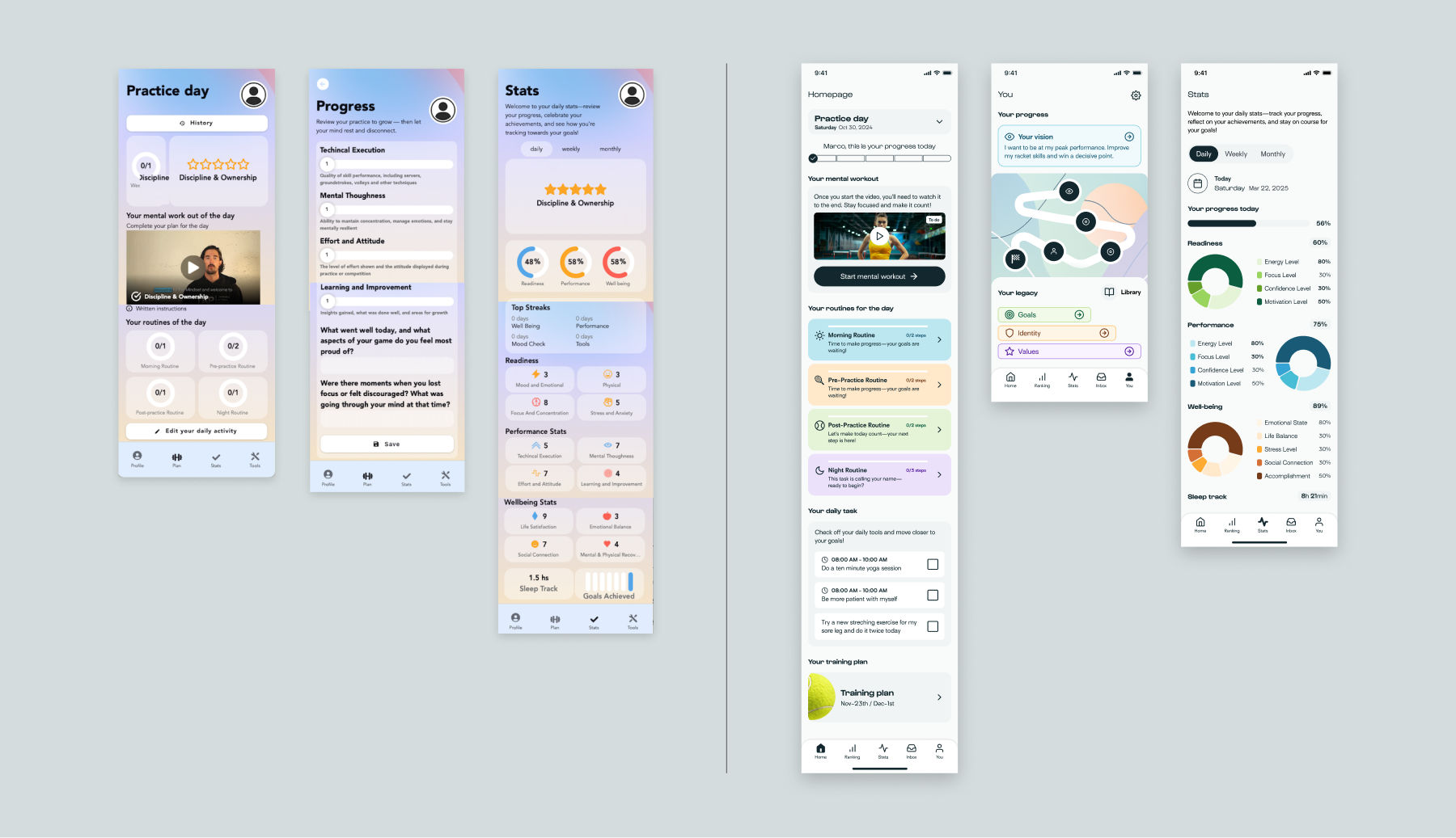
Before and after comparison of TAP Mindset product foundations
BEFORE Separate destinations competing for attention.→AFTER Daily practice, progress and reflection connected.

The product needed to feel like one thing, too.

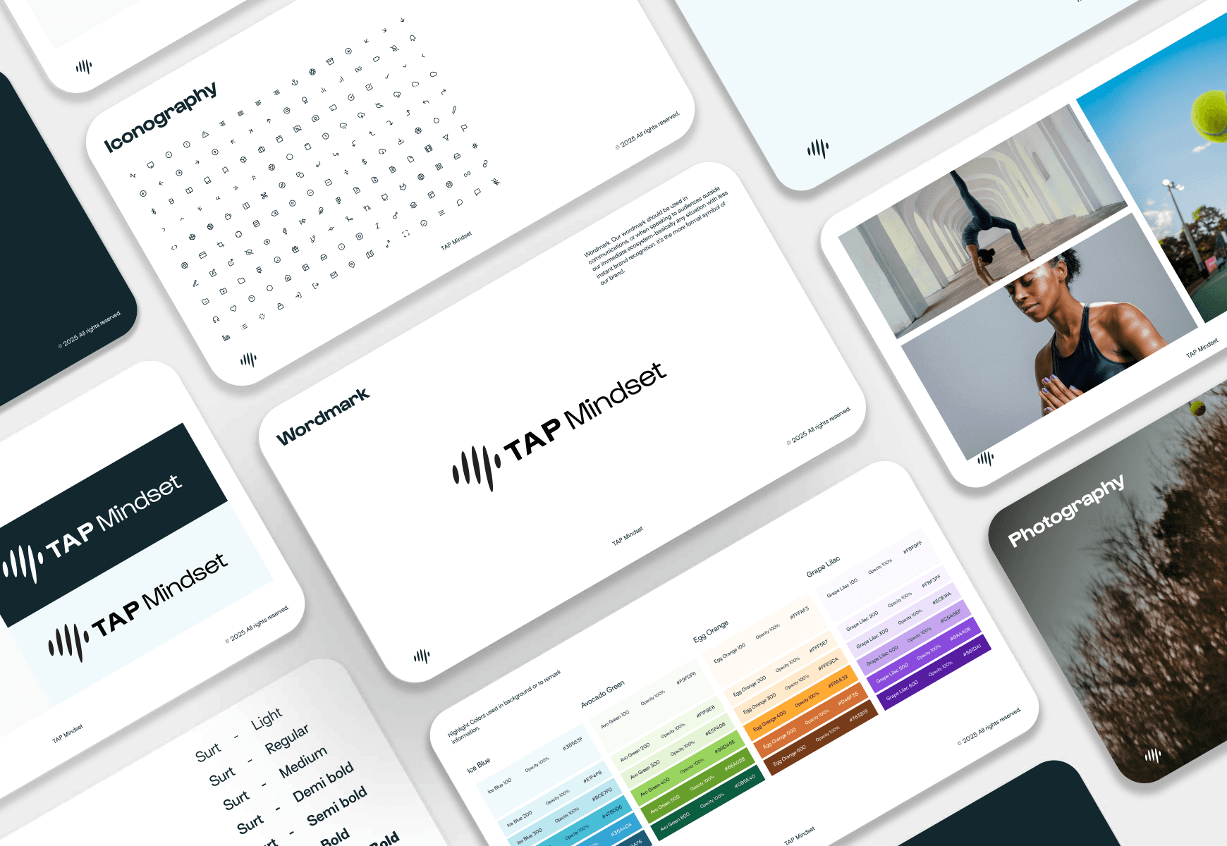
I translated the same principles into a visual language for product and communication: a recognisable wordmark, restrained iconography, an energetic but controlled palette, and photography centred on athletes rather than abstract wellness.

TAP Mindset visual identity system showing wordmark, iconography, colour, typography and photography

The system had to explain the product before anyone opened the app.

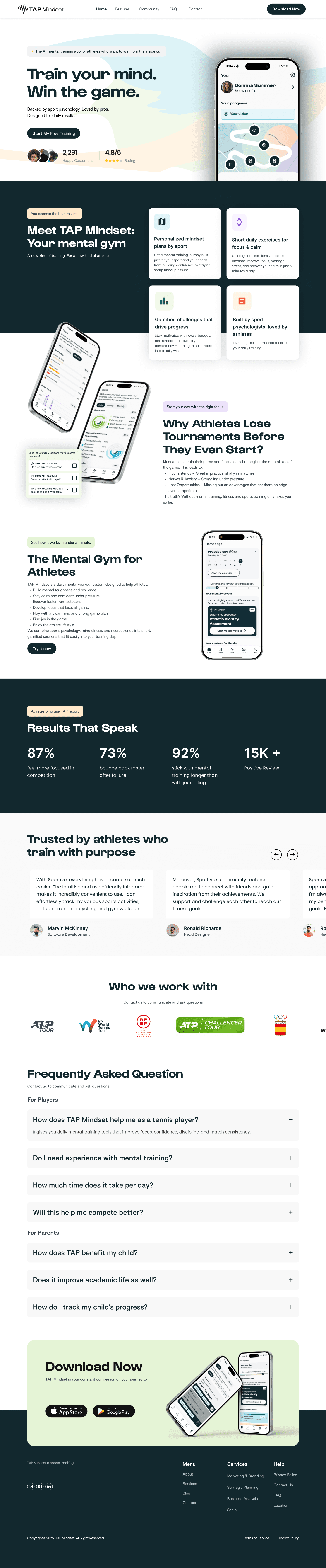
I carried the product language into the promotional site: the same hierarchy, tone and visual cues now introduce the value, show the experience and lead athletes towards download.

TAP Mindset promotional website, from hero through product benefits and download
MARKETING SITE / PRODUCT STORY IN MOTION

The outcome was not one perfect flow. It was a product whose logic survived across the experience.

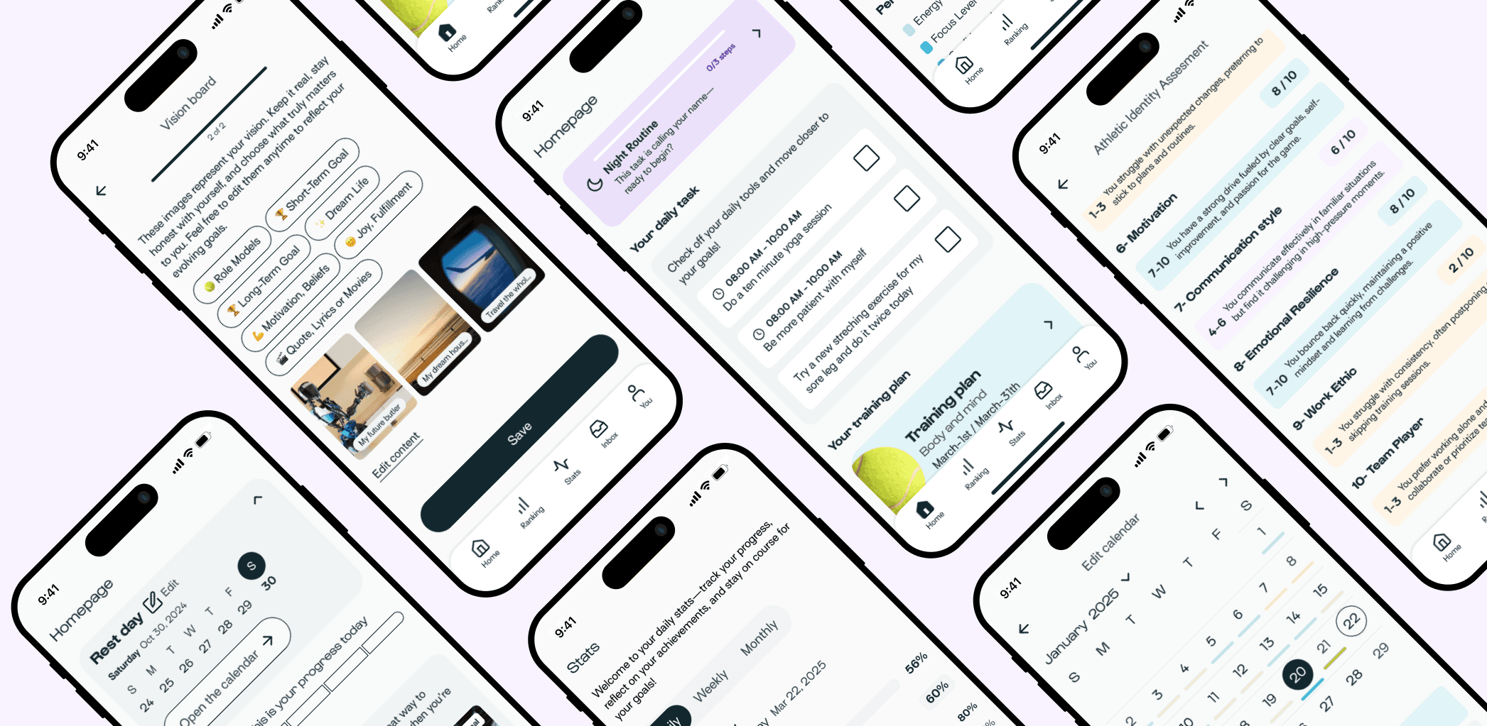
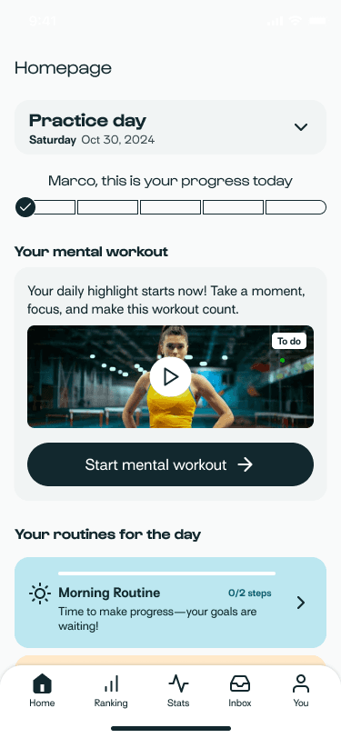
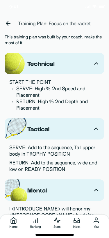
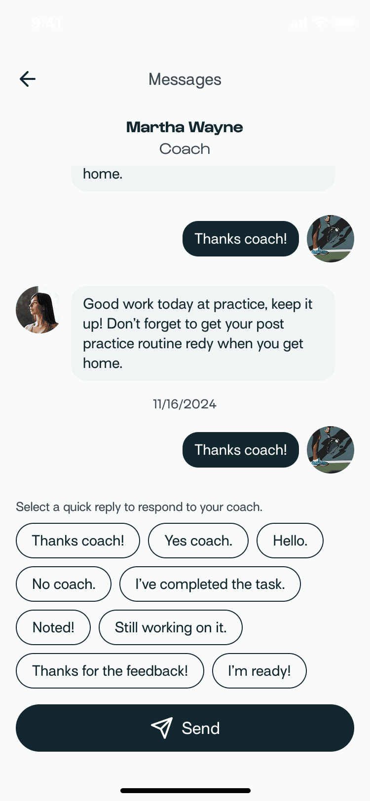
One system now connects the athlete's daily practice, preparation, training plan and conversation with a coach.

TAP Mindset final product across daily practice, preparation, planning, assessment, statistics and calendar flows
FINAL PRODUCT / ONE SYSTEM, MULTIPLE JOBS
Athlete daily practice screen
01 / DAILY PRACTICE
Athlete training plan screen
02 / PLAN
Athlete and coach messages screen
03 / COACHING
Athlete routine feedback screen
04 / REFLECTION

Clearer in testing. Ready to be proved in product.

I did not treat prototype validation as business impact. It gave us confidence in the direction and a concrete measurement plan for beta.

5/6

athletes chose the intended starting path without prompting

−38%

fewer decisions before reaching a first session in the redesigned flow

3 roles

aligned with product and domain leads in one architecture

4 signals

defined for beta: comprehension, activation, completion and return

Direction without becoming the bottleneck.

I set the architecture and principles, divided the work into role, activation and system workstreams, and gave each designer a clear decision space.

I used critique to connect local choices back to the product model, partnered with Engineering before flows hardened, and made the call when user needs, scope and buildability pulled in different directions.

The most important leadership decision was not defending the first solution. It was making the reasoning visible enough for the team to challenge it and continue the work.

The redesign became credible when the product stopped needing us to explain how its pieces fitted together.
[N. NEXT]

> MORE WORK