
I used to think the first job of a design system was to define the right components. The product taught me to start somewhere less comfortable: with the decisions teams were already repeating.
The visible problem was inconsistency
TAP Mindset had eight card variations, six chips and four inputs. Most looked related but behaved differently. Consolidating them sounded like the obvious answer.
The deeper problem was maintenance. Knowledge lived in individual files and documenting a component took 45 to 60 minutes. Every new feature made the library harder to understand.
Count usage before drawing the answer
I mapped the critical flows and inspected more than 28,000 component instances. I was not looking for the most popular rectangle. I was looking for repeated product decisions.
- Load-bearing patterns used across critical journeys.
- Accidental variants representing the same concept.
- Local exceptions created for a constraint that had never been evaluated systemically.
Turn the audit into a decision tool
For each cluster I recorded its job, states, usage, behavioural differences and cost of change. That changed the review from ‘which version looks cleaner?’ to ‘does the product need these concepts to behave differently?’
The useful output was not a giant spreadsheet. It was a smaller set of decisions with enough evidence for Design and Engineering to challenge together.
What I would reuse
Start with one important journey, capture concepts rather than screenshots and record uncertainty explicitly. Do not promote a pattern into the system just because it appears often: repetition can be evidence of debt too.
The goal is not perfect consistency. It is a system where a shared decision is easier to use than another local exception.
Three artefacts. One inspectable system.
The proof follows the same path as the work: inventory what exists, structure the decisions, then publish the result where Design and Engineering can question it together.
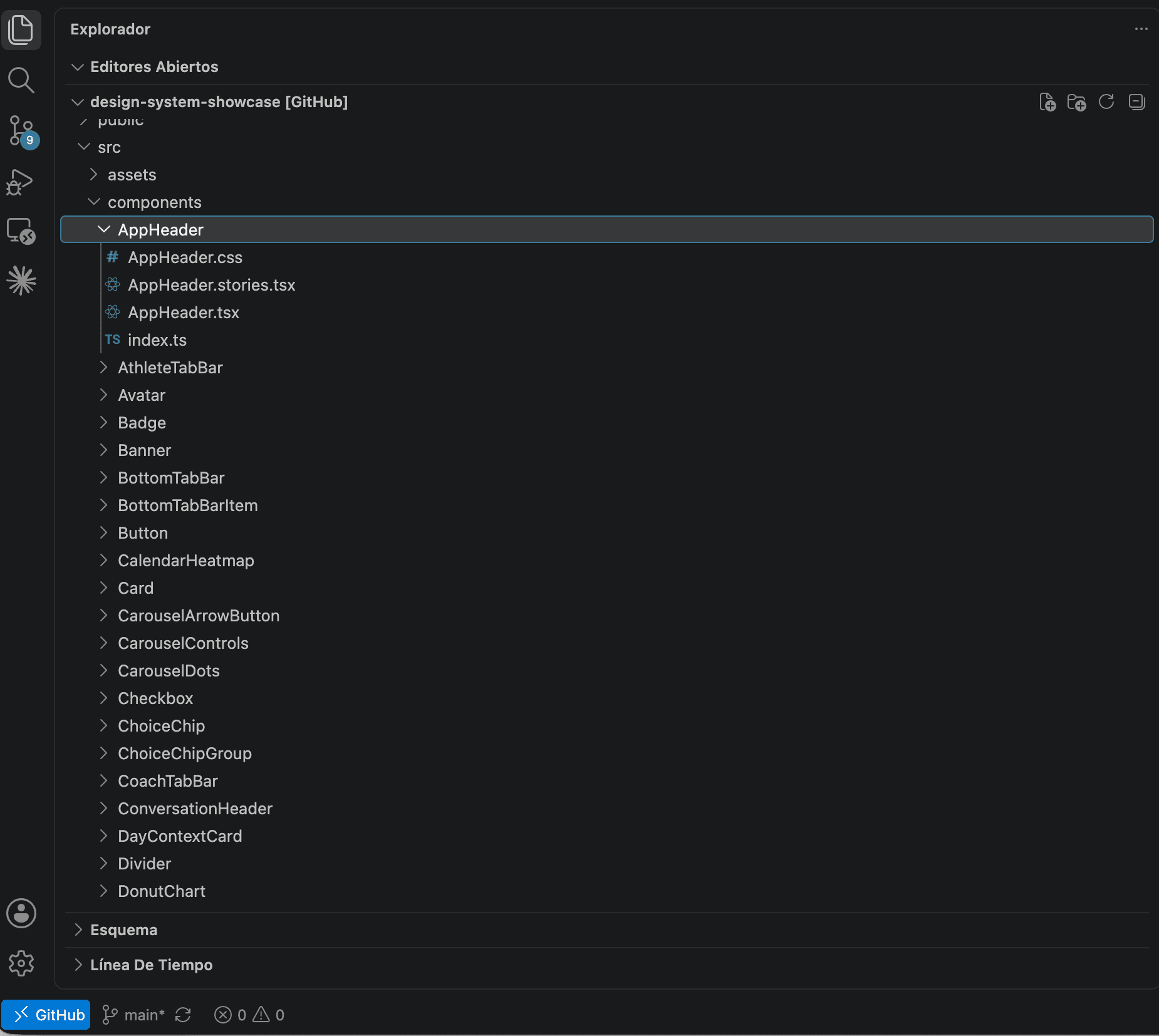
First, I made the real maintenance surface visible.
Each component lived with its implementation, styles, Storybook story and public export. The inventory let me compare product concepts instead of relying on a collection of screenshots.
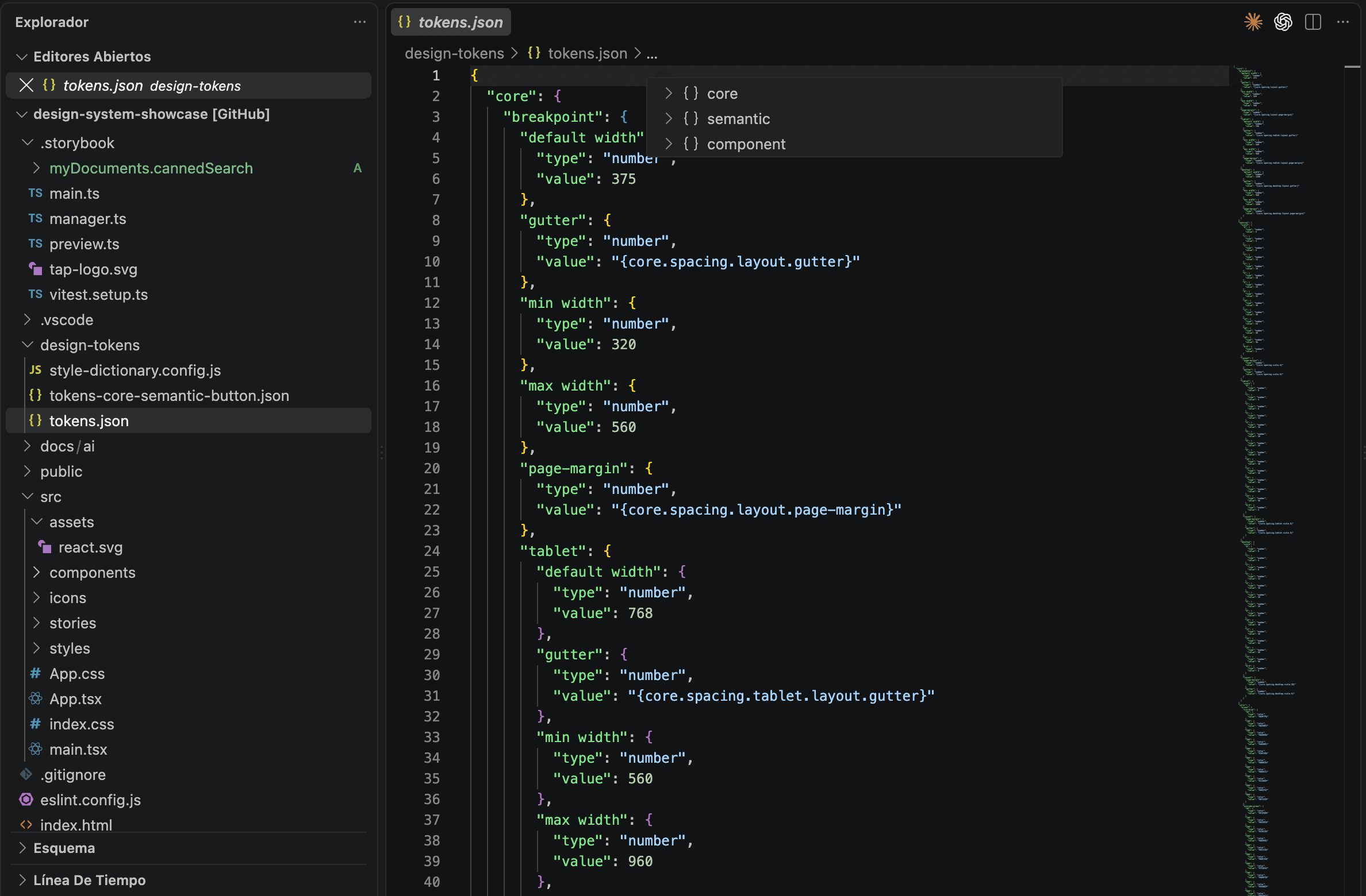
Then I separated values from meaning and component decisions.
Core, semantic and component layers use typed JSON and aliases. Style Dictionary transforms the same inspectable source instead of asking every component to store its own interpretation.
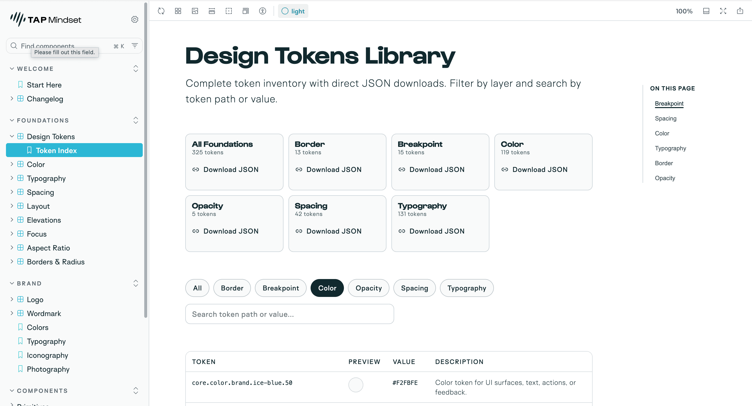
Finally, the decisions became visible where the team reviewed the work.
Storybook connects the token inventory with the components that actually ship. Designers can inspect intent and states; engineers can follow the same decision into its API and source.
What you can reuse.
Not just a conclusion: these are the working artefacts behind the argument. Open them, question them and adapt what is useful.
Layered token source
Core, semantic and component decisions expressed as inspectable JSON aliases.
Open tokens.jsonComponent anatomy
A real component kept beside its styles, story and public export.
Inspect AppHeaderPublished token inventory
The maintained token source exposed where the team reviews the system.
Open Storybook