
For a while I treated Figma as the place where the design system had to be recreated and maintained. I changed my position when the coded component became the more reliable description of what had actually shipped.
The problem was not documentation
Design and Engineering were reviewing two representations of the same component. Names, defaults and edge cases could drift even when everybody was acting in good faith.
A handoff document could explain intent, but it could not guarantee that the state being discussed still matched the public API in code.
Put the contract next to the implementation
I used Storybook to bring foundations, real React components, documentation and behavioural states into one inspectable place. TypeScript props described the public options; stories made those options visible.
A designer could review intent and states. An engineer could inspect the API and implementation without translating a separate specification.
What belongs in the source of truth
A useful story should expose the decisions a consumer needs, not every internal implementation detail.
- Supported props, defaults and variants.
- Empty, loading, error and permission states.
- Keyboard behaviour and accessible naming.
- Token references and usage guidance.
- Known constraints and decisions that still need review.
What Figma still does better
I still use Figma to explore composition, compare directions and communicate before implementation. Code-first does not mean code-only.
The boundary is simple: Figma helps us decide what might exist. Storybook shows what the team can actually use.
One contract, followed from code to behaviour.
The evidence is not three versions of the component. It is one decision moving through the system: TypeScript defines the API, Storybook makes it controllable and the stories expose the supported results.
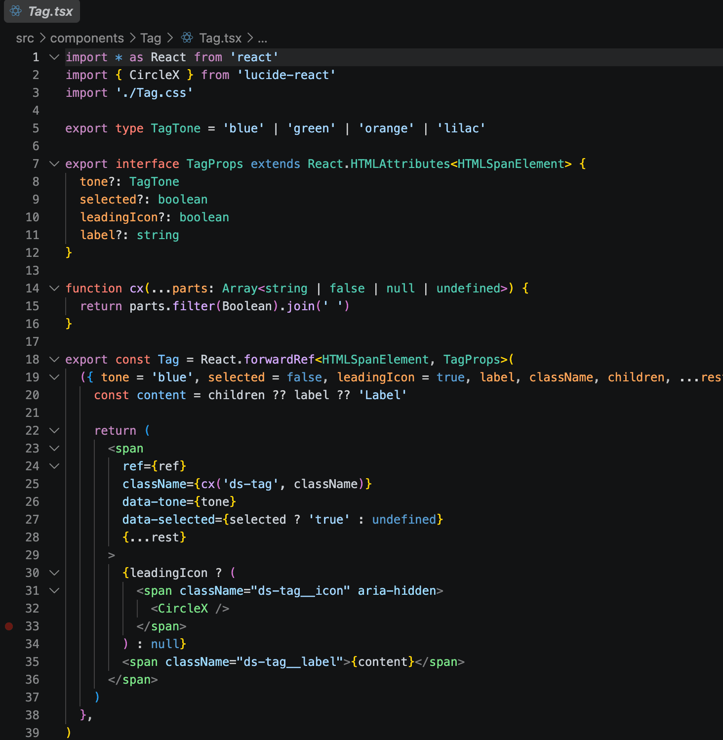
The public options start in code.
The union type and component interface make tone, selection, icon behaviour and label explicit. Defaults and rendered attributes are inspectable in the same implementation.
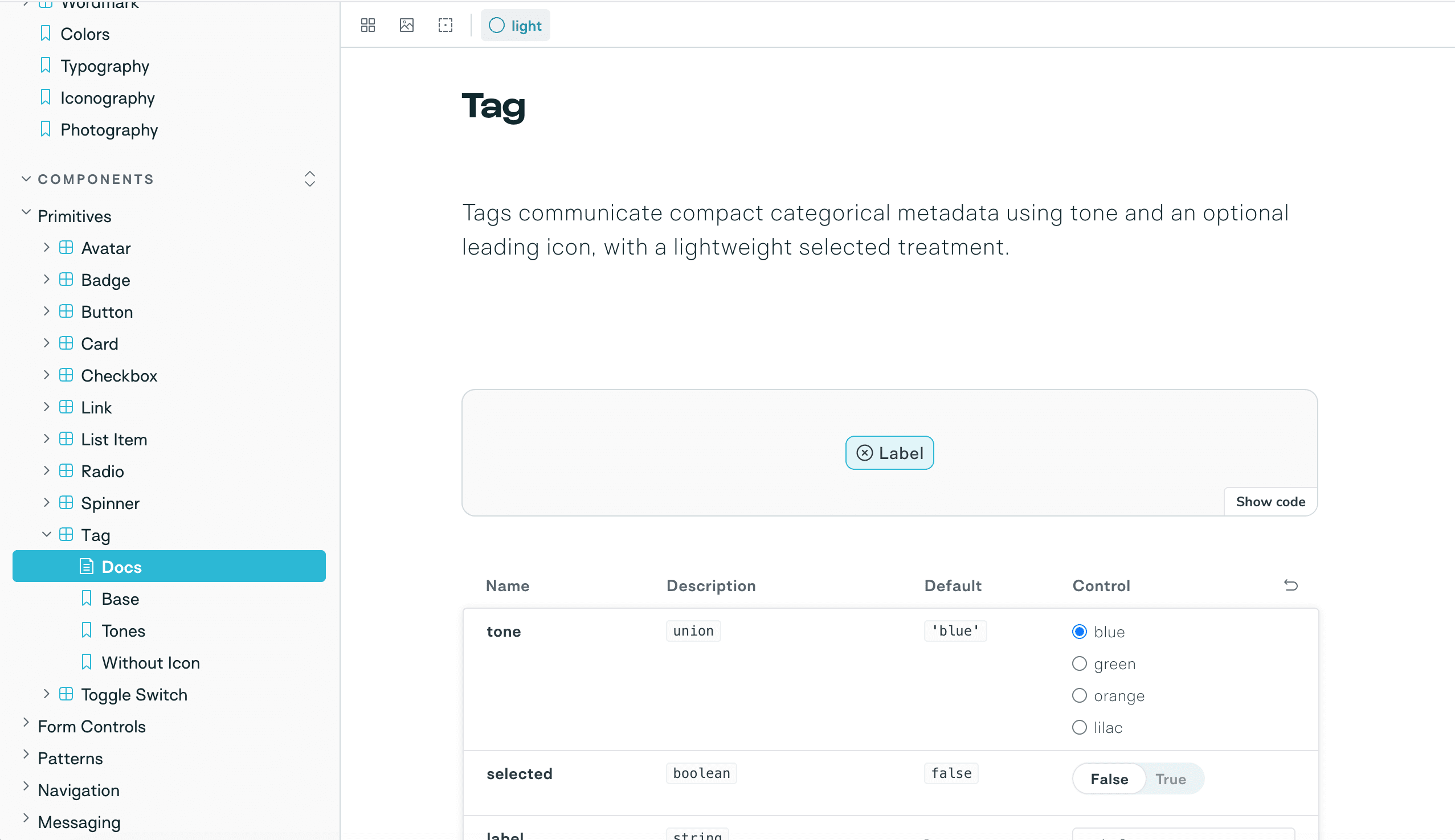
The same API becomes visible and testable.
The rendered component, property types, defaults and controls stay together. The team can change an option and inspect the result without translating a separate specification.
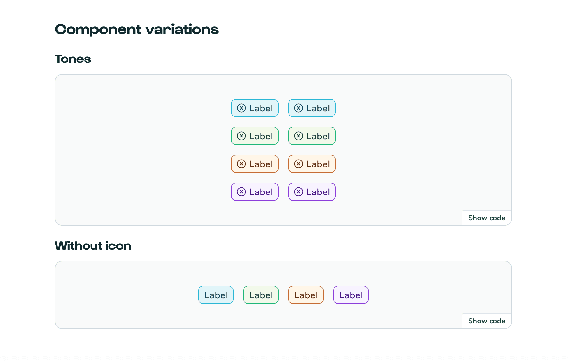
Supported variations are shown, not implied.
Tones, selected treatments and the version without an icon are documented as real outputs. Consumers can see the intended boundaries before introducing another local variant.
What you can reuse.
Not just a conclusion: these are the working artefacts behind the argument. Open them, question them and adapt what is useful.
Typed public API
The Tag contract, defaults and rendered attributes in the shipped React component.
Read Tag.tsxInspectable stories
The examples that turn supported states into reviewable behaviour.
Read Tag storiesLive documentation
The component API and its rendered output in the published Storybook.
Open Tag docs